WPF Wizards part 2 – Glass

See also WPF Wizards – Part 1

The big difference between the wizard from part 1 and how a system wizard looks, for me, is that the glass header doesn’t extend down.   Fortunately there are lots of tutorials that can help with the mechanics of how it works so I’m going to simply present my own solution, which demonstrates some useful WPF tactics.

Defining a Style

Since you will obviously want to reuse this code, I’m going to define a style, we start with something pretty simple.

<Style x:Key="Win7Wizard" TargetType="{x:Type NavigationWindow}">
    <Setter Property="MinWidth" Value="400"/>
</Style>


I’m going to use Attached Properties to avoid any need to derive a GlassWindow class from Window. Since we are using a NavigationWindow  it really wouldn’t make sense. There’s two parts you normally set, first a bool to turn it on and then you define how far it extends into the normal area. We simply need to extend down from the top, so we use this

<Setter Property="glass:GlassEffect.IsEnabled" Value="True" />
<Setter Property="glass:GlassEffect.Thickness">
    <Setter.Value>
        <Thickness Top="35"/>
    </Setter.Value>
</Setter>        


Implementing the properties

We can implement the attached properties just like this, notice the extra handler definition for when IsEnabled is modified;

public static readonly DependencyProperty IsEnabledProperty =
       DependencyProperty.RegisterAttached("IsEnabled",
       typeof(Boolean), typeof(GlassEffect),
       new FrameworkPropertyMetadata(OnIsEnabledChanged));


The actual backing values are applied in the usual manner for Dependency Properties

[DebuggerStepThrough]
public static void SetIsEnabled(DependencyObject element, Boolean value)
{
    element.SetValue(IsEnabledProperty, value);
}

[DebuggerStepThrough]
public static Boolean GetIsEnabled(DependencyObject element)
{
    return (Boolean)element.GetValue(IsEnabledProperty);
}

And not forgetting the extra handler for IsEnabled which prevents Windows 7 losing the glass.

[DebuggerStepThrough]
      public static void OnIsEnabledChanged(DependencyObject obj, 
                                                DependencyPropertyChangedEventArgs args)
      {
          if ((bool)args.NewValue == true)
          {
              try
              {
                  Window wnd = (Window)obj;
                  wnd.Activated += new EventHandler(wnd_Activated);
                  wnd.Loaded += new RoutedEventHandler(wnd_Loaded);
                  wnd.Deactivated += new EventHandler(wnd_Deactivated);
              }
              catch (Exception)
              {
                  //Oh well, we tried
              }
          }
          else
          {
              try
              {
                  Window wnd = (Window)obj;
                  wnd.Activated -= new EventHandler(wnd_Activated);
                  wnd.Loaded -= new RoutedEventHandler(wnd_Loaded);
                  wnd.Deactivated -= new EventHandler(wnd_Deactivated);
              }
              catch (Exception)
              {                    
              }
          }
      }
 

Those handlers are all very similar but I’ve chosen to implement separately for simplicities sake

[DebuggerStepThrough]
  static void wnd_Deactivated(object sender, EventArgs e)
  {
      ApplyGlass((Window)sender);
  }

  [DebuggerStepThrough]
  static void wnd_Activated(object sender, EventArgs e)
  {            
      ApplyGlass((Window)sender);
  }

  [DebuggerStepThrough]
  static void wnd_Loaded(object sender, RoutedEventArgs e)
  {            
      ApplyGlass((Window)sender);
  }


Making glass

The code to actually turn on the glass is slightly more involved. Although this is based on lots of other web based examples, note the use of DPI calculation so it still works correctly as soon as you move to 125% DPI Windows installation. I’ve also got another property which defines the colour that should be painted in the glass sections to correctly match the window when we are on XP or if glass isn’t turned on in Vista/7 so that we handle the switch between active and inactive windows.

private static void ApplyGlass(Window window)
   {
       try
       {
           // Obtain the window handle for WPF application
           IntPtr mainWindowPtr = new WindowInteropHelper(window).Handle;
           HwndSource mainWindowSrc = HwndSource.FromHwnd(mainWindowPtr);

           // Get System Dpi
           System.Drawing.Graphics desktop = System.Drawing.Graphics.FromHwnd(mainWindowPtr);
           float DesktopDpiX = desktop.DpiX;
           float DesktopDpiY = desktop.DpiY;

           // Set Margins
           GlassEffect.MARGINS margins = new GlassEffect.MARGINS();
           Thickness thickness = GetThickness(window);//new Thickness();

           // Extend glass frame into client area
           // Note that the default desktop Dpi is 96dpi. The  margins are
           // adjusted for the system Dpi.
           margins.cxLeftWidth = Convert.ToInt32((thickness.Left*DesktopDpiX/96)+0.5);
           margins.cxRightWidth = Convert.ToInt32((thickness.Right*DesktopDpiX/96)+0.5);
           margins.cyTopHeight = Convert.ToInt32((thickness.Top*DesktopDpiX/96)+0.5);
           margins.cyBottomHeight = Convert.ToInt32((thickness.Bottom*DesktopDpiX/96)+0.5);

           int hr = GlassEffect.DwmExtendFrameIntoClientArea(
                        mainWindowSrc.Handle, 
                        ref margins);
           if (hr < 0)
           {
               //DwmExtendFrameIntoClientArea Failed      
               if(window.IsActive)
                   SetGlassBackground(window, SystemColors.GradientActiveCaptionBrush);
               else
                   SetGlassBackground(window, SystemColors.GradientInactiveCaptionBrush);
           }
           else
           {
               mainWindowSrc.CompositionTarget.BackgroundColor = Color.FromArgb(0, 0, 0, 0);
               SetGlassBackground(window, Brushes.Transparent);
           }


       }
       // If not Vista, paint background as control.
       catch (DllNotFoundException)
       {
           SetGlassBackground(window, SystemColors.ControlBrush);
       }
   }

The only downside of this code is that we rely on the System.Drawing dll which isn’t referenced by default for WPF. You simply have to remember to add the reference or else you will get.

The type or namespace name 'Drawing' does not exist in the 
namespace 'System' (are you missing an assembly reference?)

Putting it all together

The final step is simply to turn on the glass by applying the style to the window, first since I’ve defined the style in a ResourceDictionary, you can add that once to your App.xaml by adding the highlighted bit below.

<Application x:Class="BlogWPFWizard.App"
             xmlns="http://schemas.microsoft.com/winfx/2006/xaml/presentation"
             xmlns:x="http://schemas.microsoft.com/winfx/2006/xaml"
             StartupUri="MainWindow.xaml">
    <Application.Resources>
        <ResourceDictionary>
            <ResourceDictionary.MergedDictionaries>
                <ResourceDictionary Source="Style\Win7wizard.xaml" />
            </ResourceDictionary.MergedDictionaries>
        </ResourceDictionary>
    </Application.Resources>
</Application>

And then we apply the style to the Window

<NavigationWindow x:Class="BlogWPFWizard.MainWindow"
        xmlns="http://schemas.microsoft.com/winfx/2006/xaml/presentation"
        xmlns:x="http://schemas.microsoft.com/winfx/2006/xaml"
        Title="MainWindow" Height="350" Width="525"
                  Style="{StaticResource Win7Wizard}"
        >
  
</NavigationWindow>


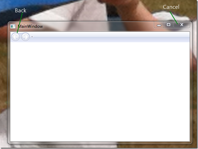
And there we have the glass, the only problem is you can’t see it, because the Navigation window is in the way.  If you look really closely you can see the missing black line on either side of the Navigation header.

wiz2-1

Building the glass layout

One quick and dirty way round this is to start to quickly define an empty template for the Navigation Window. I’m going to define a section for the top, which we will bind the BackGround colour as generated above, and also define a ContentPresenter so we can inject the pages into.

<Setter Property="Template">
   <Setter.Value>
      <ControlTemplate>

         <DockPanel x:Name="mainDock"  LastChildFill="True" >
         <!-- The border is used to compute the rendered height with margins.
             topBar contents will be displayed on the extended glass frame.—>
             <Border DockPanel.Dock="Top" 
                Background="{TemplateBinding glass:GlassEffect.GlassBackground}" 
                x:Name="glassPanel" Height="36">
                <!-- Wizard controls will go here-->
             </Border>
                        
             <Border 
                BorderThickness="{TemplateBinding Border.BorderThickness}" 
                BorderBrush="{TemplateBinding Border.BorderBrush}" 
                Background="{TemplateBinding Panel.Background}">                            
                <!-- Content area ie where Pages go -->
                <AdornerDecorator >                                    
                   <ContentPresenter                                 
                      Content="{TemplateBinding ContentControl.Content}" 
                      ContentTemplate="{TemplateBinding ContentControl.ContentTemplate}" 
                      ContentStringFormat="{TemplateBinding 
                                               ContentControl.ContentStringFormat}"
                      Name="PART_NavWinCP" ClipToBounds="True" />                                                                          
                </AdornerDecorator>                                
             </Border>
         </DockPanel>

      </ControlTemplate>
   </Setter.Value>
</Setter>

Running this proves our glass integration has worked, but also removes the chrome that makes the wizard work.wiz2-2
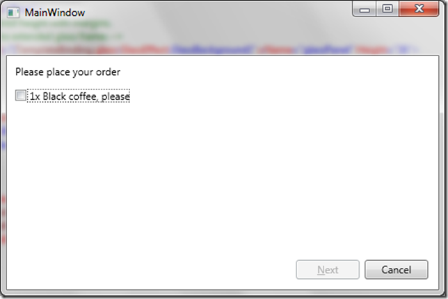
It does leave a perfect starting point for the next post.
WPF Wizards – Part 1

(Yes, I should have written this article years ago.)

I never got round to writing a Wizard control for WPF which seems always felt wrong given the hours I spent in developing something in WinForms that even Microsoft reused, but don’t despair, I’ll let you into a secret. You don’t need a specific wizard control, you just need to tweak what is available freely.

Wizards post Vista

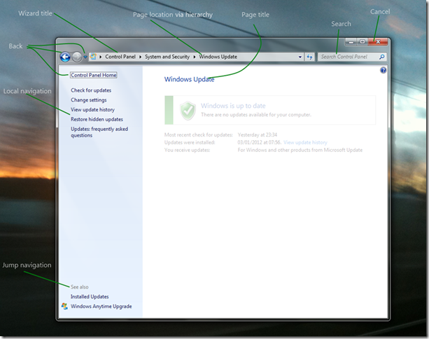
First lets compare wizards as they changed for Vista, which is no easy task because when looking around on Windows 7, there are very few true wizards left.

wiz1

All the same features are still there but back has now moved up to the top. I like that there is a use of glass to group the features that are global across the wizard, such as the Wizard title, Cancel (well Close) and also Back. We can still use Next and Back to navigate through a set of pages which are in a single linear sequence, and although some wizards may choose a new page sequence depending on their input, the same input should give the same sequence.

However as I said above wizards aren’t the main way of gathering more complicated input in Windows 7.

Navigation UI

Vista introduced was a further derivative of Wizards, a way of not just following a sequential path, but also of jumping around between pages used to gather settings. Navigation windows effectively give you access to many different pages of information, and provide hierarchical navigation, related link navigation and context sensitive search and filtering.wiz2

The only wizard feature thing that’s missing from this form of UI is the Next button, so we simply design our pages to accommodate that.

WPF Navigation Windows

So my plan for this series of posts is to take a simple System.Windows.NavigationWindow and turn it into a fully featured NavigationWindow as above. If you read the documentation it talks about Frames, Pages and PageFunctions and so far that doesn’t sound very much like a wizard. So my first post of this series is going to start with the simplest possible wizard.

I’m going to use the example of ordering a coffee as the business process this Wizard will support but initially our coffee shop will have a very small menu.

A simple WPF Wizard

Start by creating a new Visual Studio WPF Window (or a new WPF application if you aren’t adding this to an existing app).

Open MainWindow.xaml and change the opening and closing tags from Window to NavigationWindow.

<NavigationWindow x:Class="BlogWPFWizard.MainWindow" 
xmlns=http://schemas.microsoft.com/winfx/2006/xaml/presentation 
xmlns:x=http://schemas.microsoft.com/winfx/2006/xaml 
Title="MainWindow" Height="350" Width="525"> 
</NavigationWindow> 

Now open MainWindow.xaml.cs and change the base class from Window to NavigationWindow

/// <summary>
/// Interaction logic for MainWindow.xaml
/// </summary>
public partial class MainWindow : NavigationWindow 
{
       public MainWindow()
       {
           InitializeComponent();
       }
   }

Running this gives us the expected UI.

wiz3

Firstly, the Last Page

Now we need some content. I’m going to start on the last page first and work forwards simply so that I can demonstrate how this fits with MVVM as I go along. Right clicking on your Project in Visual Studio gives you a Add submenu where one item is Page. Clicking this and giving the name LastPage creates us a fairly blank looking canvas in the WPF design View. All I’ve done is dropped a couple of Buttons and some text into my page.

wiz4

And the xaml

<Page x:Class="BlogWPFWizard.LastPage" 
 xmlns=http://schemas.microsoft.com/winfx/2006/xaml/presentation
 xmlns:x=http://schemas.microsoft.com/winfx/2006/xaml
 xmlns:mc=http://schemas.openxmlformats.org/markup-compatibility/2006
 xmlns:d=http://schemas.microsoft.com/expression/blend/2008
 mc:Ignorable="d" d:DesignHeight="100" d:DesignWidth="300" 
 Title="LastPage">
 <Grid>
 <Button Content="Cancel" Height="23" HorizontalAlignment="Right" Margin="0,0,12,12"
 Name="button1" VerticalAlignment="Bottom" Width="75" />
 <Button Content="Fi_nish" Height="23" HorizontalAlignment="Right" Margin="0,0,93,12"
 Name="button2" VerticalAlignment="Bottom" Width="75" />
<TextBlock Height="23" HorizontalAlignment="Left" Margin="12,12,0,0" 
 Name="textBlock1" Text="Thanks for your order" VerticalAlignment="Top" />
 </Grid>
</Page> 

If you run this now you’ll get a blank UI, exactly the same as before. We need to tell the NavigationWindow to display the Page in its Frame.

Open MainWindow.xaml.cs and add the following to the constructor,

public MainWindow()
{
   InitializeComponent();
 Navigate(new LastPage());       
}

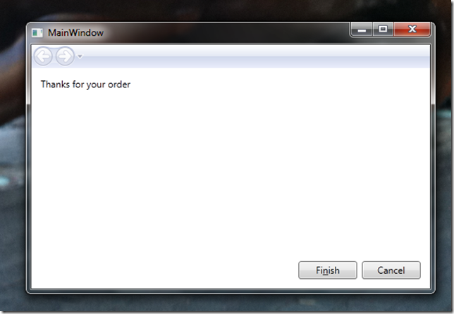
Now we get the expected UI, although the buttons don’t do anything (see the source code at the bottom of this post for the full implementation).

wiz5

MVVM and Pages

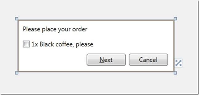
We can now add another new Page, lets call this one FirstPage. First pages job is simply to get our order. It can do all this because initially our shop only provides black coffee and only one at a time.

wiz6

Now we have some data here to store and so we also create a view model, in this case, I’ll create an OrderViewModel, and I’m going to include some logic to generate a simple order (again see the source code for the implementation of the Model classes).

class OrderViewModel
{
 public bool Wants1xBlackCoffee { get; set; }
 public Order Order { get; set; }

 public void GenerateOrder()
  {
    Order = new Order();

    if (Wants1xBlackCoffee)
    {
        Order.Drinks.Add(new BlackCoffee());
    }            
  }

We wire up the bindings in the View to the ViewModel as usual.

<Page x:Class="BlogWPFWizard.FirstPage" …
 Title="FirstPage">
 <Grid>
 <Button Content="Cancel" Margin="0,0,12,12" Name="button1" Height="23"
 VerticalAlignment="Bottom" HorizontalAlignment="Right" Width="75" />
 <Button Content="_Next" Height="23" HorizontalAlignment="Left" Margin="132,0,0,12" 
 Name="button2" VerticalAlignment="Bottom" Width="75" />
 <TextBlock Height="23" HorizontalAlignment="Left" Margin="10,10,0,0" 
 Name="textBlock1" Text="Please place your order" VerticalAlignment="Top" />
 <CheckBox Content="1x Black coffee, please" Margin="10,39,0,0" 
 VerticalAlignment="Top" HorizontalAlignment="Left"/>
 </Grid>
</Page>

As usual in an MVVM application we use the DataContext to link the View and the ViewModel so our new Startup logic can be

public MainWindow()
{
    InitializeComponent();

    Navigate(
        new FirstPage {
            DataContext = new OrderViewModel()
        });
}


What we haven’t done here is to protect against empty orders, i.e. an order with no drinks in it, because although it might be a perfectly logical thing to have an empty order, nobody is going to accept it. I’m choosing to intercept that only in the UI and basically I’m going to disable the Next button unless you order 1xBlack Coffee. We use Commands on the ViewModel to achieve this.

 public OrderViewModel()
   {
       GenerateOrderCommand = new RelayCommand(
           _ => GenerateOrder(),
           _ => IsValidOrder);
   }
  
   public bool IsValidOrder
   {
       get { return Wants1xBlackCoffee; }
   }

   public RelayCommand GenerateOrderCommand { get; set; }

So now in our ViewModel we have all the logic to generate an order. What we don’t have is any logic to handle moving between pages.

So where do we put our Navigation then?

In order to actually change pages, we simply need to call the NavigationService’s Navigate method. Unfortunately the NavigationService is a only available from the View tier, on NavigationWindows, or Page class derivatives.

So there is a very common pattern I find myself using. I declare the business logic in a ViewModel command such as above, and then declare the Navigation logic in a command declared in the View tier and which delegates down to the business logic command as well.

public FirstPage()
       {
           InitializeComponent();

           GoNextCommand = new RelayCommand(
               _ => GoNext(),
               _ => CanGoNext());
       }

       private bool CanGoNext()
       {
           var orderViewModel = DataContext as OrderViewModel;
           return orderViewModel.GenerateOrderCommand.CanExecute(null);
       }

       public void GoNext()
       {
           var orderViewModel = DataContext as OrderViewModel;
           if (orderViewModel != null)
           {
               orderViewModel.GenerateOrderCommand.Execute(null);
               NavigationService.Navigate(
                   new LastPage {
                       DataContext = this.DataContext
                   });
           }
       }

       public RelayCommand GoNextCommand { get; set; }

An example wizard

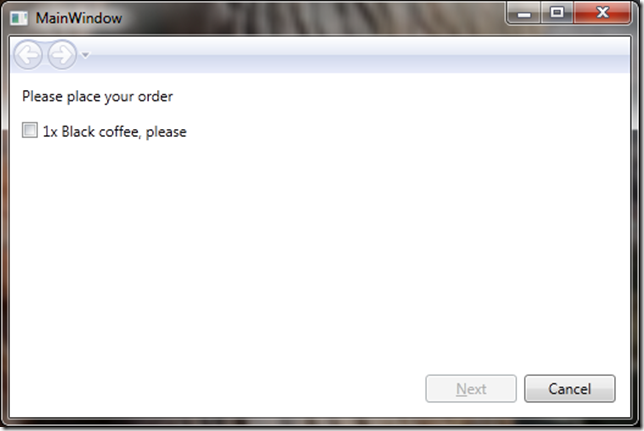
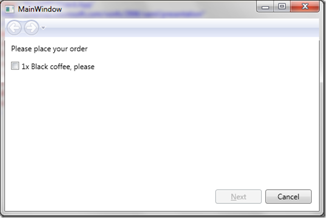
Putting it all together we now have an initial dialog that won’t take an order.

wiz7

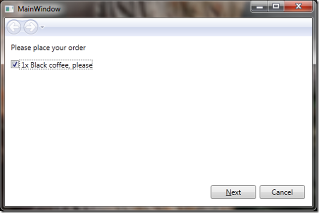
Click the checkbox to take an order and enable Next

wiz8

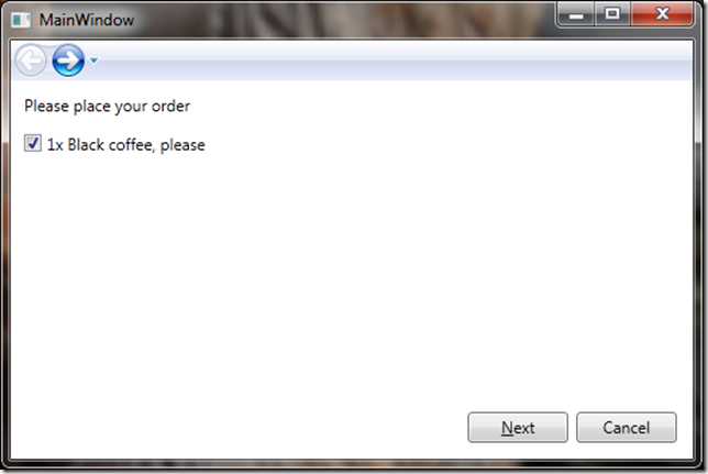
And after hitting next you have an enabled back option

wiz9

Which takes you back to the valid state (i.e. still ticked)

wiz10

More soon

This is now probably much longer than I originally intended my first post to be. My next post will look at improving the look of Wizard, incorporating glass into the UI, removing the forward button and drop down.