(Yes, I should have written this article years ago.)
I never got round to writing a Wizard control for WPF which seems always felt wrong given the hours I spent in developing something in WinForms that even Microsoft reused, but don’t despair, I’ll let you into a secret. You don’t need a specific wizard control, you just need to tweak what is available freely.
Wizards post Vista
First lets compare wizards as they changed for Vista, which is no easy task because when looking around on Windows 7, there are very few true wizards left.

All the same features are still there but back has now moved up to the top. I like that there is a use of glass to group the features that are global across the wizard, such as the Wizard title, Cancel (well Close) and also Back. We can still use Next and Back to navigate through a set of pages which are in a single linear sequence, and although some wizards may choose a new page sequence depending on their input, the same input should give the same sequence.
However as I said above wizards aren’t the main way of gathering more complicated input in Windows 7.
Navigation UI
Vista introduced was a further derivative of Wizards, a way of not just following a sequential path, but also of jumping around between pages used to gather settings. Navigation windows effectively give you access to many different pages of information, and provide hierarchical navigation, related link navigation and context sensitive search and filtering.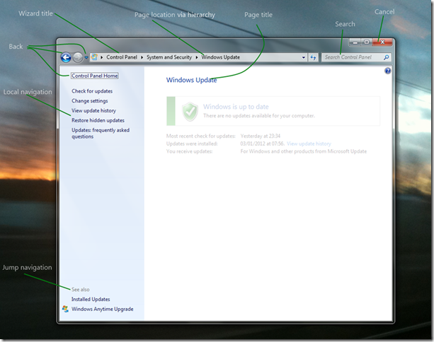
The only wizard feature thing that’s missing from this form of UI is the Next button, so we simply design our pages to accommodate that.
WPF Navigation Windows
So my plan for this series of posts is to take a simple System.Windows.NavigationWindow and turn it into a fully featured NavigationWindow as above. If you read the documentation it talks about Frames, Pages and PageFunctions and so far that doesn’t sound very much like a wizard. So my first post of this series is going to start with the simplest possible wizard.
I’m going to use the example of ordering a coffee as the business process this Wizard will support but initially our coffee shop will have a very small menu.
A simple WPF Wizard
Start by creating a new Visual Studio WPF Window (or a new WPF application if you aren’t adding this to an existing app).
Open MainWindow.xaml and change the opening and closing tags from Window to NavigationWindow.
<NavigationWindow x:Class="BlogWPFWizard.MainWindow"
xmlns=http://schemas.microsoft.com/winfx/2006/xaml/presentation
xmlns:x=http://schemas.microsoft.com/winfx/2006/xaml
Title="MainWindow" Height="350" Width="525">
</NavigationWindow>
Now open MainWindow.xaml.cs and change the base class from Window to NavigationWindow
/// <summary>
/// Interaction logic for MainWindow.xaml
/// </summary>
public partial class MainWindow : NavigationWindow
{
       public MainWindow()
       {
           InitializeComponent();
       }
   }
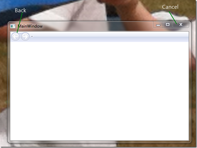
Running this gives us the expected UI.
Firstly, the Last Page
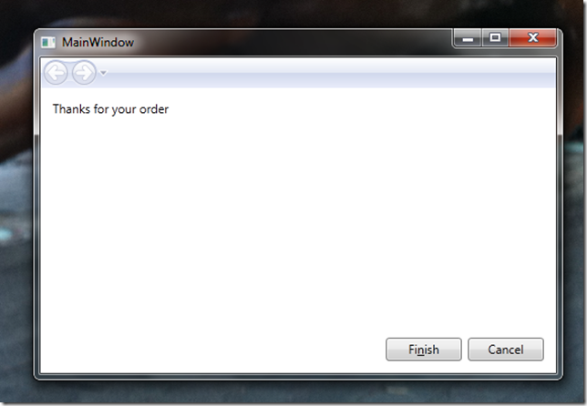
Now we need some content. I’m going to start on the last page first and work forwards simply so that I can demonstrate how this fits with MVVM as I go along. Right clicking on your Project in Visual Studio gives you a Add submenu where one item is Page. Clicking this and giving the name LastPage creates us a fairly blank looking canvas in the WPF design View. All I’ve done is dropped a couple of Buttons and some text into my page.

And the xaml
<Page x:Class="BlogWPFWizard.LastPage"
 xmlns=http://schemas.microsoft.com/winfx/2006/xaml/presentation
 xmlns:x=http://schemas.microsoft.com/winfx/2006/xaml
 xmlns:mc=http://schemas.openxmlformats.org/markup-compatibility/2006
 xmlns:d=http://schemas.microsoft.com/expression/blend/2008
 mc:Ignorable="d" d:DesignHeight="100" d:DesignWidth="300"
 Title="LastPage">
 <Grid>
 <Button Content="Cancel" Height="23" HorizontalAlignment="Right" Margin="0,0,12,12"
 Name="button1" VerticalAlignment="Bottom" Width="75" />
 <Button Content="Fi_nish" Height="23" HorizontalAlignment="Right" Margin="0,0,93,12"
 Name="button2" VerticalAlignment="Bottom" Width="75" />
<TextBlock Height="23" HorizontalAlignment="Left" Margin="12,12,0,0"
 Name="textBlock1" Text="Thanks for your order" VerticalAlignment="Top" />
 </Grid>
</Page>
If you run this now you’ll get a blank UI, exactly the same as before. We need to tell the NavigationWindow to display the Page in its Frame.
Open MainWindow.xaml.cs and add the following to the constructor,
public MainWindow()
{
   InitializeComponent();
 Navigate(new LastPage());
}
Now we get the expected UI, although the buttons don’t do anything (see the source code at the bottom of this post for the full implementation).
MVVM and Pages
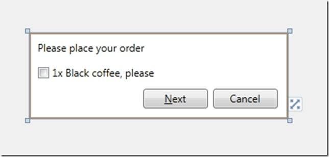
We can now add another new Page, lets call this one FirstPage. First pages job is simply to get our order. It can do all this because initially our shop only provides black coffee and only one at a time.
Now we have some data here to store and so we also create a view model, in this case, I’ll create an OrderViewModel, and I’m going to include some logic to generate a simple order (again see the source code for the implementation of the Model classes).
class OrderViewModel
{
 public bool Wants1xBlackCoffee { get; set; }
 public Order Order { get; set; }

 public void GenerateOrder()
  {
    Order = new Order();

    if (Wants1xBlackCoffee)
    {
        Order.Drinks.Add(new BlackCoffee());
    }
  }
We wire up the bindings in the View to the ViewModel as usual.
<Page x:Class="BlogWPFWizard.FirstPage" …
 Title="FirstPage">
 <Grid>
 <Button Content="Cancel" Margin="0,0,12,12" Name="button1" Height="23"
 VerticalAlignment="Bottom" HorizontalAlignment="Right" Width="75" />
 <Button Content="_Next" Height="23" HorizontalAlignment="Left" Margin="132,0,0,12"
 Name="button2" VerticalAlignment="Bottom" Width="75" />
 <TextBlock Height="23" HorizontalAlignment="Left" Margin="10,10,0,0"
 Name="textBlock1" Text="Please place your order" VerticalAlignment="Top" />
 <CheckBox Content="1x Black coffee, please" Margin="10,39,0,0"
 VerticalAlignment="Top" HorizontalAlignment="Left"/>
 </Grid>
</Page>
As usual in an MVVM application we use the DataContext to link the View and the ViewModel so our new Startup logic can be
public MainWindow()
{
    InitializeComponent();

    Navigate(
        new FirstPage {
            DataContext = new OrderViewModel()
        });
}
What we haven’t done here is to protect against empty orders, i.e. an order with no drinks in it, because although it might be a perfectly logical thing to have an empty order, nobody is going to accept it. I’m choosing to intercept that only in the UI and basically I’m going to disable the Next button unless you order 1xBlack Coffee. We use Commands on the ViewModel to achieve this.
 public OrderViewModel()
   {
       GenerateOrderCommand = new RelayCommand(
           _ => GenerateOrder(),
           _ => IsValidOrder);
   }

   public bool IsValidOrder
   {
       get { return Wants1xBlackCoffee; }
   }

   public RelayCommand GenerateOrderCommand { get; set; }
So now in our ViewModel we have all the logic to generate an order. What we don’t have is any logic to handle moving between pages.
So where do we put our Navigation then?
In order to actually change pages, we simply need to call the NavigationService’s Navigate method. Unfortunately the NavigationService is a only available from the View tier, on NavigationWindows, or Page class derivatives.
So there is a very common pattern I find myself using. I declare the business logic in a ViewModel command such as above, and then declare the Navigation logic in a command declared in the View tier and which delegates down to the business logic command as well.
public FirstPage()
       {
           InitializeComponent();

           GoNextCommand = new RelayCommand(
               _ => GoNext(),
               _ => CanGoNext());
       }

       private bool CanGoNext()
       {
           var orderViewModel = DataContext as OrderViewModel;
           return orderViewModel.GenerateOrderCommand.CanExecute(null);
       }

       public void GoNext()
       {
           var orderViewModel = DataContext as OrderViewModel;
           if (orderViewModel != null)
           {
               orderViewModel.GenerateOrderCommand.Execute(null);
               NavigationService.Navigate(
                   new LastPage {
                       DataContext = this.DataContext
                   });
           }
       }

       public RelayCommand GoNextCommand { get; set; }
An example wizard
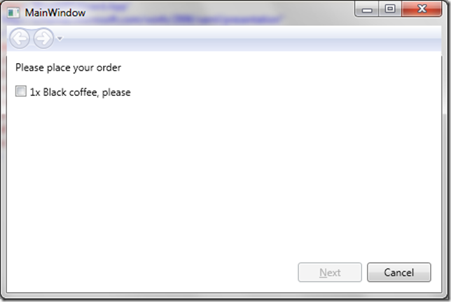
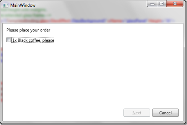
Putting it all together we now have an initial dialog that won’t take an order.
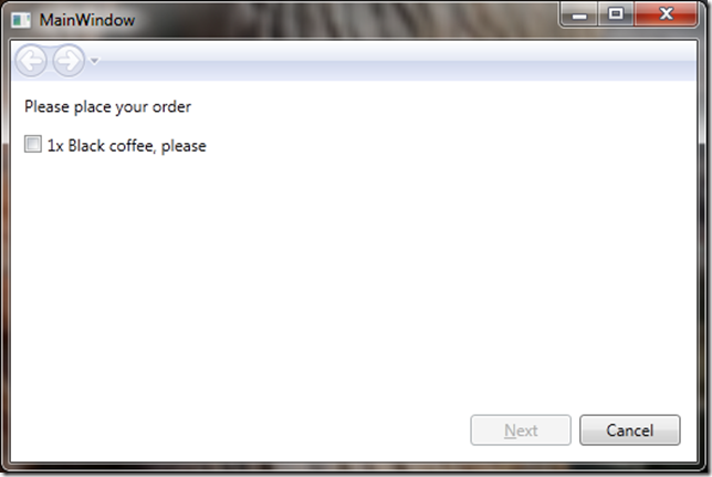
Click the checkbox to take an order and enable Next
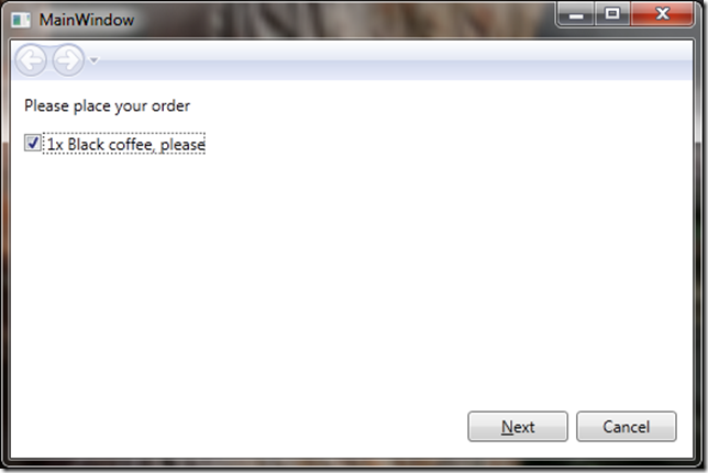
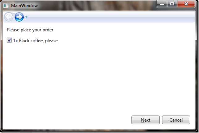
And after hitting next you have an enabled back option

Which takes you back to the valid state (i.e. still ticked)
More soon
This is now probably much longer than I originally intended my first post to be. My next post will look at improving the look of Wizard, incorporating glass into the UI, removing the forward button and drop down.


You must be logged in to post a comment.